Category
BrandingAbout This Project
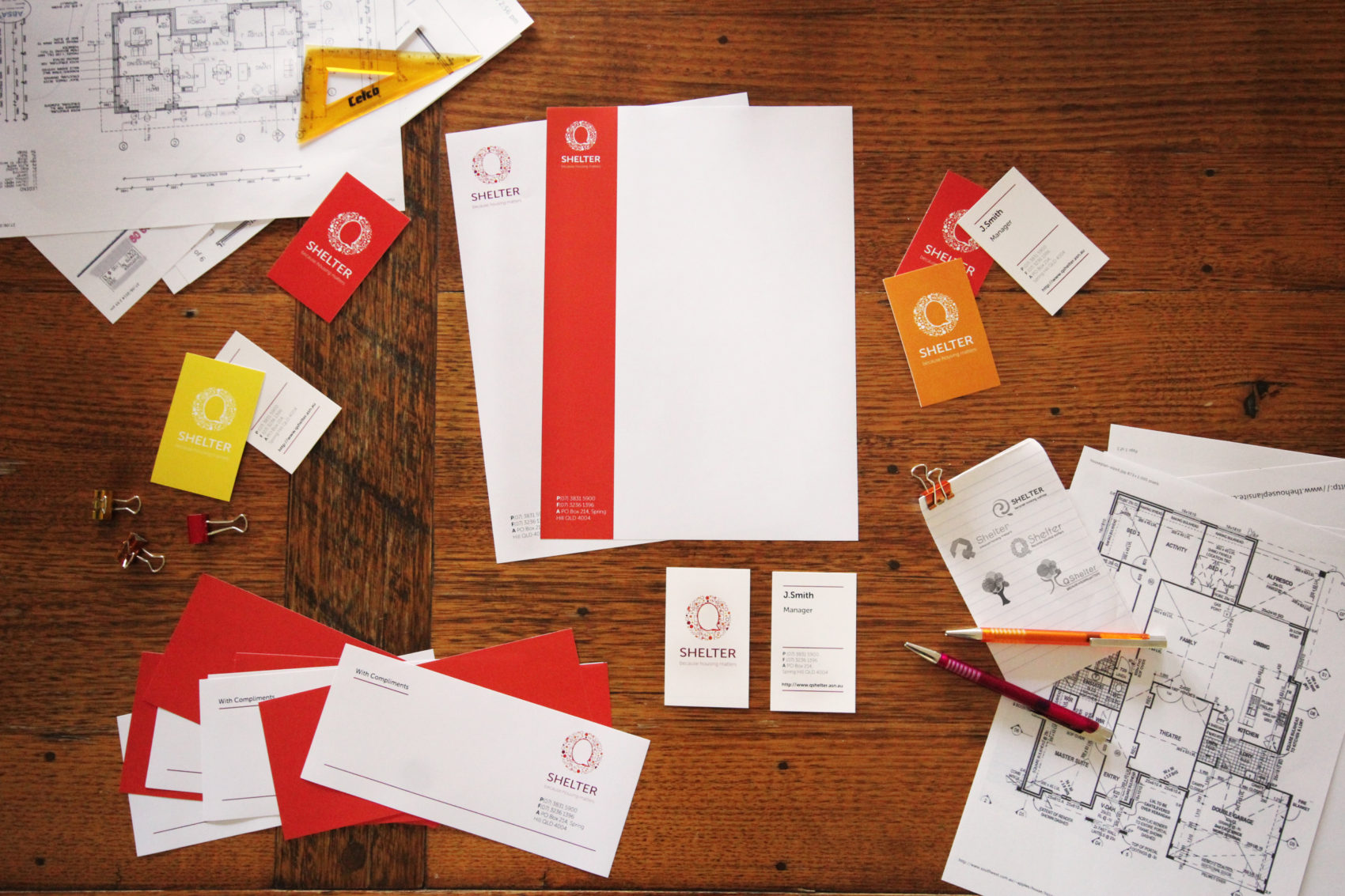
Q Shelter works passionately behind the scenes, assisting the development of better housing. Unfortunately, Q Shelter’s visual identity was dated and did not represent the new business direction, thus creating confusion. Focused Marketing Solutions’ aim was to bring Q Shelter back into the future and communicate to the public exactly what Q Shelter stands for.
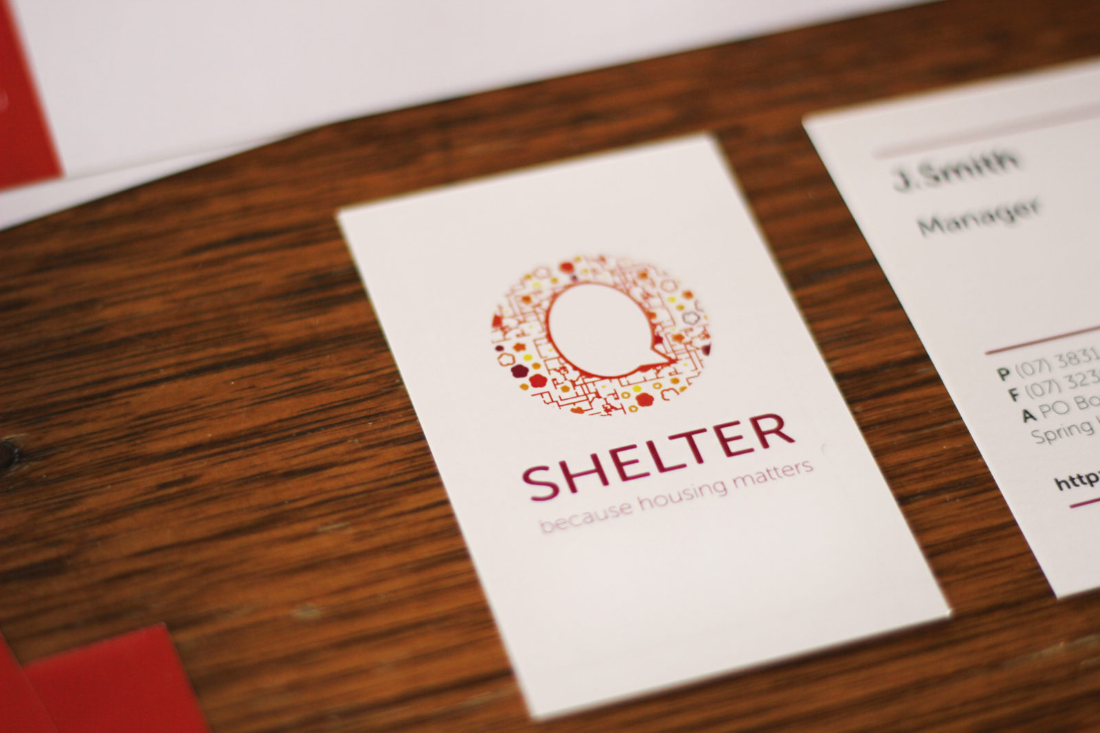
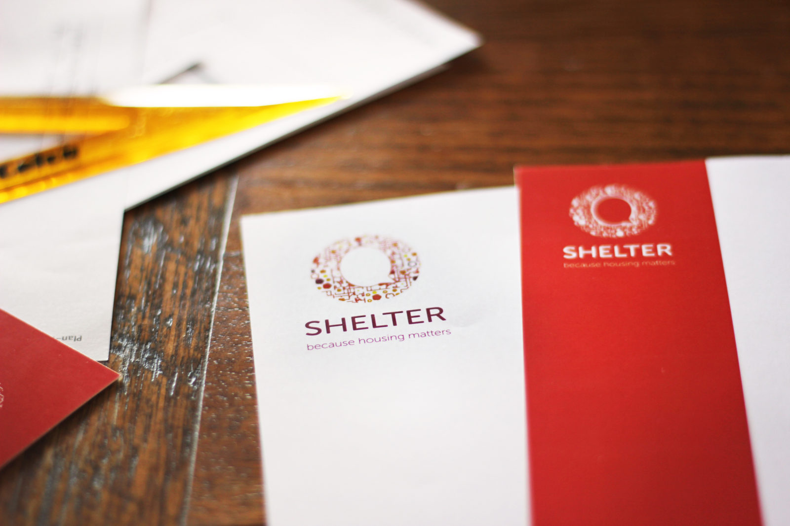
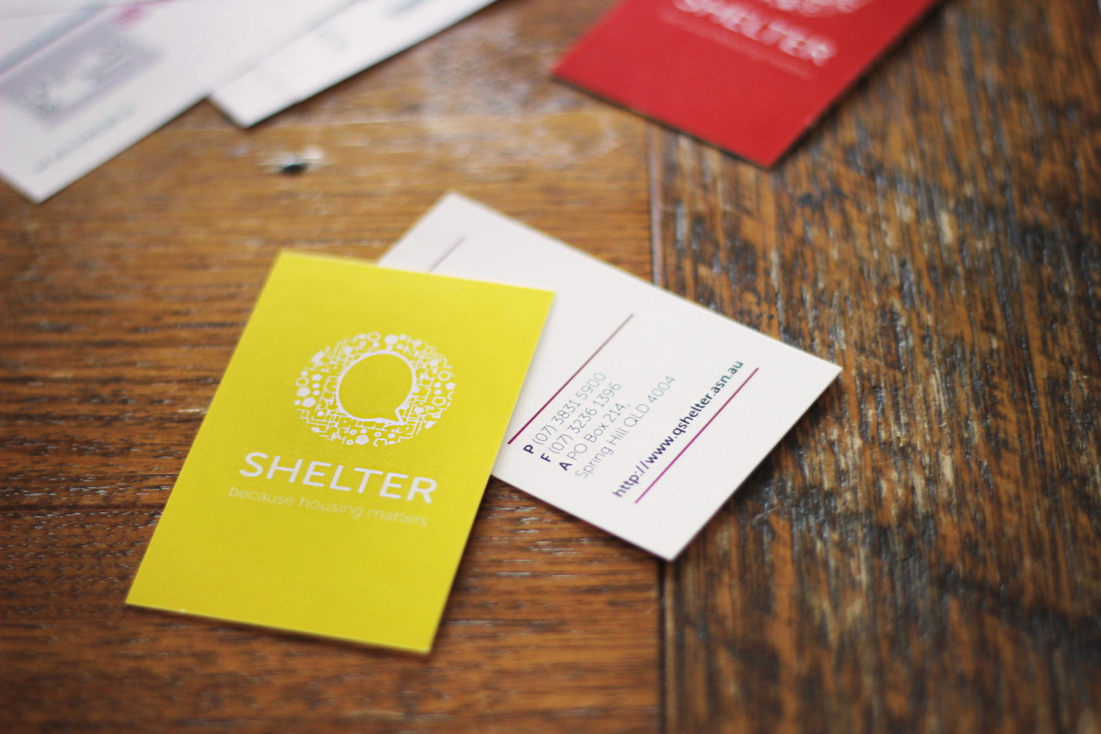
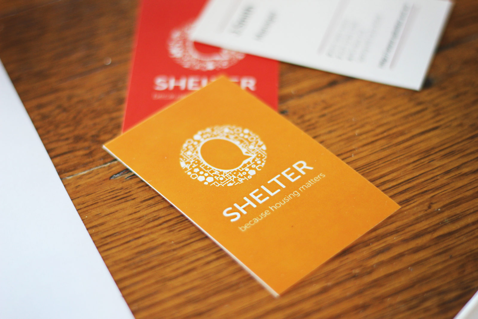
Key words used to describe Q Shelter were researched to develop visual connections, these included; coming together, community, support and advice. A stylised representation of community was the goal of the design through the aesthetic of a microchip (an item used to store information). This successfully portrays Q Shelter’s knowledge and ability to see the bigger picture in community planning. The ‘Q’ in Q Shelter is shaped like a question mark, which further strengthens the theme of knowledge and advice. Bright colour palettes and a clean sans serif font was created to give the logo a vibrant strength.
Q Shelter’s corporate identity has been modernised to represent the brand’s values and what the company’s services can offer the community, in a friendly, professional and approachable aesthetic. The brand ticked all the boxes for Q Shelter’s needs and speaks at both a personal and corporate level.
All work owned and produced by Focused Marketing Solutions.


