
Category
BrandingAbout This Project
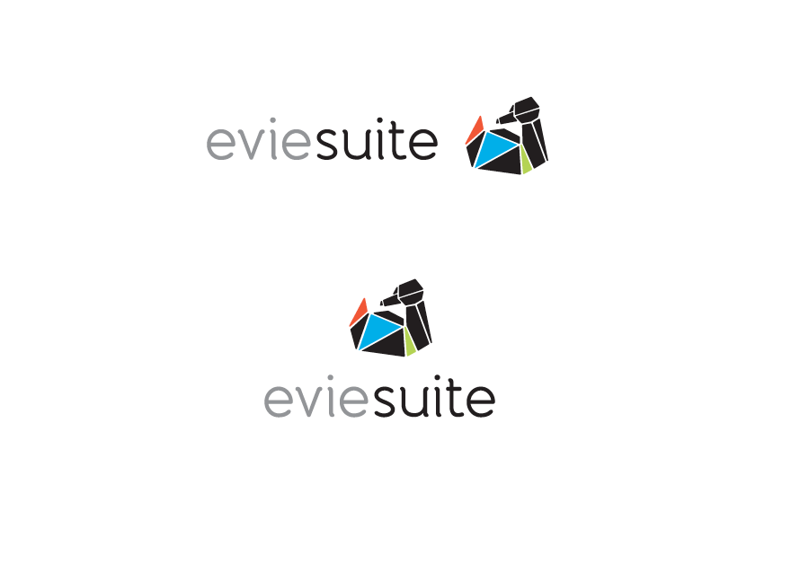
Evie is an online only event application solution, easy to use, friendly and engaging and tailored to each client.
The brief was that the logo must be engaging and friendly (with a possible character) whist still retaining a sense of professionalism.
Using the keywords to describe the brand; Easy, carefree, easy to grasp, an idiom was used for further research of the brand- ‘Like a duck to water‘
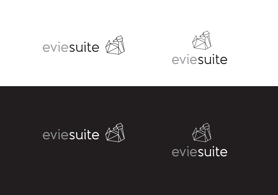
The duck was chosen as it could easily be a visual character for the brand as requested. The origami aesthetic was chosen as the craft is hand made with care and precision. Paper can also change shape, refolded into another purpose while still retaining it’s original qualities. Blank paper can also lead to endless possibilities, much like the product, Evie.
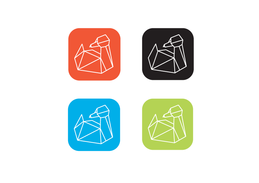
Fragments of the duck are used to represent the various options within the system, when purchased together combine the duck and therefore the product as a whole. This further creates a strong sense of consistency for the new brand, Evie.