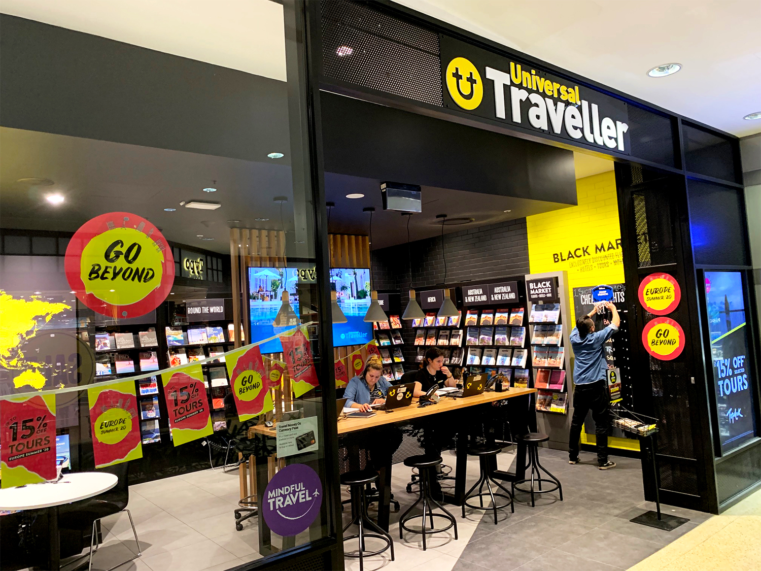
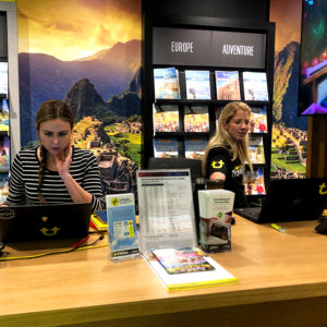
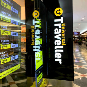
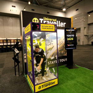
Student Flights are a brand within the ASX listed Flight Centre Travel Group. Student Flights has been in operation for over 25 years, however to allow the company to continue to grow – a name change and re-brand was required to reposition Student Flights in front of a wider target audience – This is because Student Flights has grown to sell more than just flights and they service more than just students. Student Flights was now to be known as Universal Traveller and an entire re-brand was designed and rolled out to accompany this name change. This included a new logo, store front, fit out, print and web content & templates, expo and outdoor advertising design as well as a complete overhaul of all corporate and customer facing content.
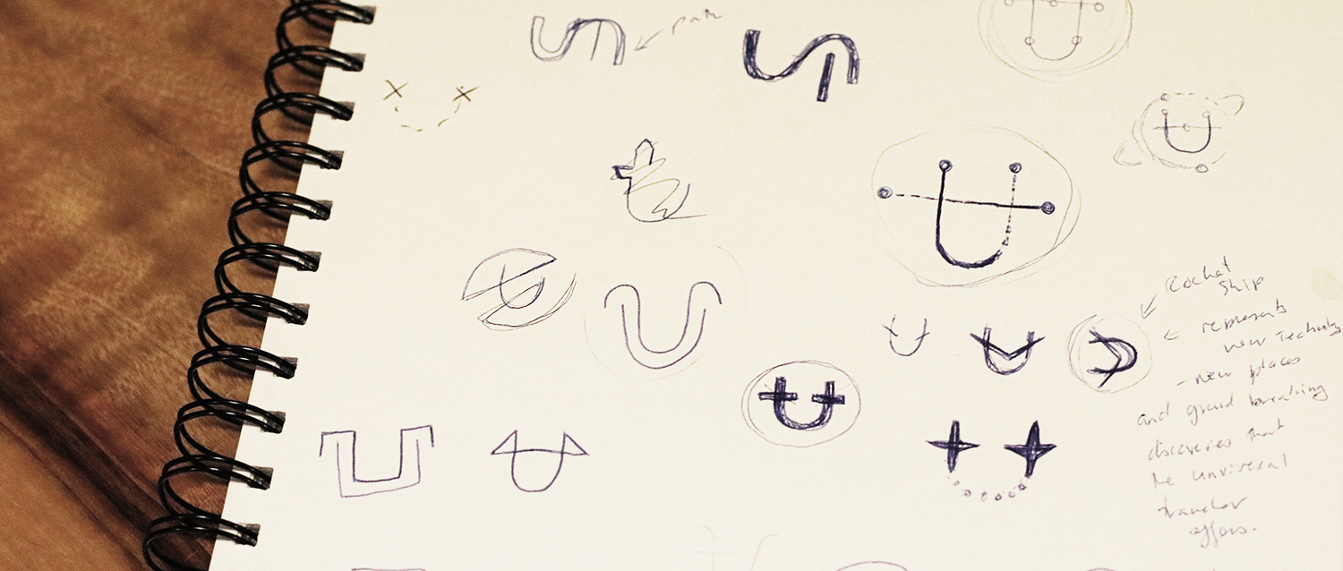
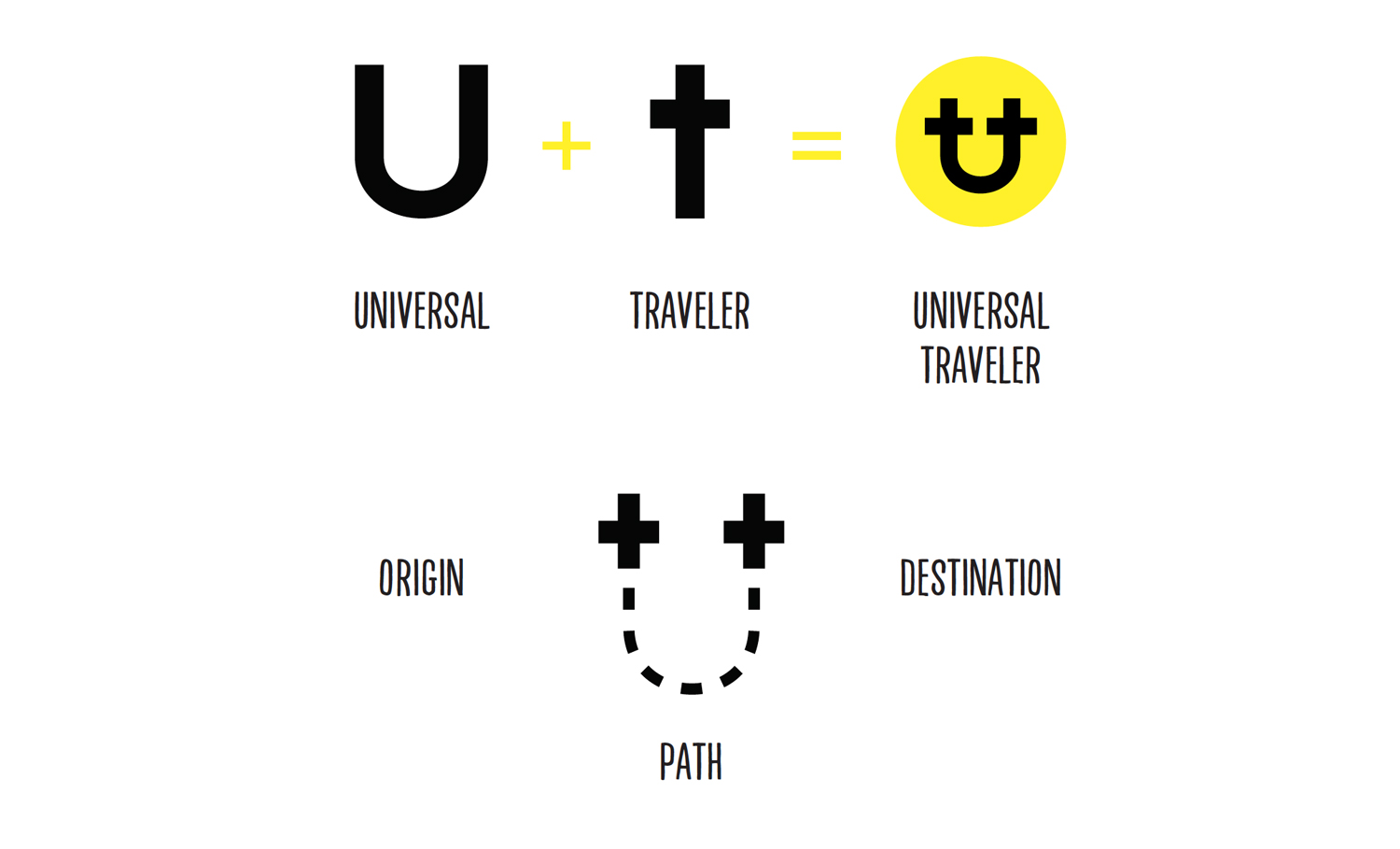
The pictorial logo selected for the re-brand is a recognizable and simplified design element that compliments the existing text logo of ‘The Universal Traveler’- the thickness of the stroke is consistent with the text size and balances the font. This logo is also recognizable as a joint image of the letters ‘U’ and ‘T’.
The icon is also intended to be reminiscent of a path- with two crosses- one representing the customer’s origin and the other – their destination. As each customer’s journey is unique this was important to incorporate into Universal Travellers logo.


